Much Ado About Color
I remember sitting down in class, and teacher explaining how to use the color wheel.
It took me a bit, as you were supposed to spin the darn thing, goodness.
If you make a color circle out of the ROY G BIV, Red, Orange, Yellow, Green, Blue, Newton, and Violet.
The colors that are opposite, are supposed to be special, when you divide the contraption in three, and four…
You get a triad or tetrad, and a slap on the face on top of your fake education.
The only color theory that matters, is the history of oil paints.
How the art masters evolved their vision, and a crash course in that is this.
Paint black and white, or dark brown and light brown, and then glaze colors on top of it.
You first create a perfect realistic black and white, and then gently add color.
But you need to know paints and where they come from, even if just out of respect.
My heart still hurts from college cheating me out of that, I remember burnt umber, but I feel so betrayed, that it hurts.
Burnt Umber, has got to be one of the prettiest things I’ve ever sounded.
And as I work on my software, coming closer and closer to creating useful things.
From having spent ages learning, and now having AI as my trusty side-kick.
I have a need to color my user interfaces, even though I haven’t created much for show.
I justneed to know how I am going to color things, so that I can program things towards that.
Bootstrap the design framework that I appreciate for its slow wisdom, has a notion of context.
As in dark, or warning, or primary, or secondary, and even alert, it is not a very cleanly defined thing, but it is wise, but ugly.
Their warning yellow, is terrible, and that is because, it is not just the color, it is also the background that makes the color.
Pretty color in one place, is often pretty ugly in other places.
My favorite coding theme, Solarized, had only two good colors, to match the blue-green background, nice blue and nice pink.
These do wonders for code, and I created a maroon color that looks irridescent in relation to the background.
It really looks like it belongs, so that makes 3 colors, which is slim pickings even for a code editor theme.
Last month I’ve spent some time looking at terminal colors, colors for the things that hackers use in movies.
Thinking that if there is anyone who wastes time on perfect colors, is it is a corporate wizard.
But it was solarize again, and a popular gray variant, and an attractive looking amber one, but that is literally one color on a dark background.
That the word in color harmony crisis is an understatement, currently only AI does good color schemes, it is true.
So color theory came up again recently, I wanted to fix the darn thing, and get me some color.
You have already heard of the most important thing, it is not just the color, it is the background, and the surrounding area.
A serious programmer, would now stop us and say, just sample a 3D environment where colors tend to be perfectly cohenrent.
But there is a color thing, that can be made to work, without much effort.
Because we begin with a sound color harmony already: gradients.
We should call it color interpolation, the meeting of two colors.
Works great on background, you can lighten up the text to make a perfect match.
But that is not enough to account for color contexts, such as danger red, or success green, of info blue.
And then dark mode, which must have its own, danger or success.
At which point, we might as well, add many themes.
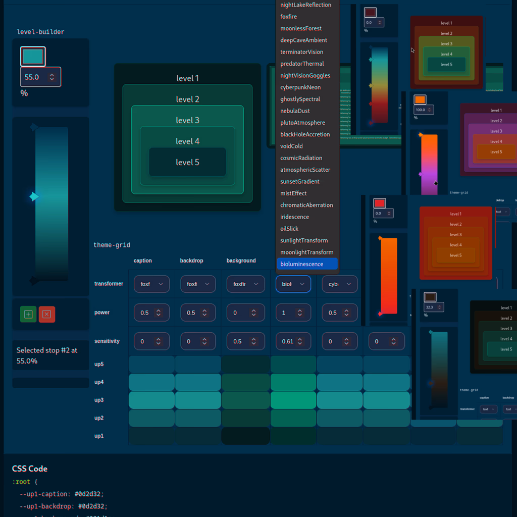
The way I approached color theory here, is by imagining a dark basement gradient.
That moves up a building, to higher floors, and my program starts with a dark to light gradient.
But the notion of danger context, requires redness, on each floor.
So today I added dolor functions to my program, where every color transformation stuff like night, lighting bug, terminator-vision.
Has a power, and a second setting, that sets how much of that transformation is used.
I called the two power of transformation, and general sensitivity.
If you can't see the title image, the bare bone result, without much configuration.
Is instant color synchronization, precisely because of the gradient.
Gradient of like or dissimilar colors even, always works, because of the blending.
And just like masters glazing over color, my color transformation functions only add a tiny bit.
I know that this is not a theory of color, but this is proof.
That the color theory, has little to say, about which colors go geometer.
That gradients is where color harmonies live, unlike the questionable tetrad or triad.
So as long as you keep your gradient simple, the results are always beautiful.
In conclusion, this creation, functions very much like a color moder.
But here you are in control of the universe, you say what makes a spectrum and in which order.
And which color transfomration function, lifts or lowers parts of it.